As I began my software engineering career, I was captivated by the visual aspects of applications—whether it was a web applications, or mobile apps. Throughout my journey, I’ve recently realized that as applications scale and grow, building user interfaces becomes more challenging, especially when more developers are involved. This led me to dive deeper into studying reusable components, including design system and style guides, which form the foundation of our UI.
In this post, I’ll share my learning experience from implementing a design system in my personal website. The reason behind this post is I’ve developed and iterated on it numerous times, but I often found myself changing the entire theme and components, which led to inconsistency and a lack of cohesion across the site.
P.S. This is also my first experience with web development, so there are probably quite a few mistakes along the way—feel free to point them out, I’d really appreciate it!
Three things you need
There are three key elements needed to develop a UI for an app, based on Leerob post.
- Style guides : A set of rules that we follow, including constants like hex colors, padding sizes, fonts, and typefaces that represent the brand. This ensures components are built consistently. If we make changes, they stay within these guidelines, reducing the risk of breaking the design.
- Design system : The implementation of the style guides. For example, when creating a button, it must adhere to the style guide’s rules (e.g., correct fonts and colors). This approach makes components more robust and easier to maintain, even with multiple developers working on them. It also encourages building reusable, less duplicated code
- Component library : It combines everything mentioned above—style guides and component libraries—into one complete system, along with detailed documentation and principles to ensure everything stays consistent. It’s like a blueprint that guides the design and development of your app.
Define design principles and our design token as a style guides
To begin, we need to define design principles and a style guide. This time, I’ve adopted principles inspired by Material Design and Apple HIG, with a bit of my own twist. The focus is on Scalability, Clarity, Efficiency, and Simplicity.
Scalability
- Purpose : Design systems should be able to grow as the product or team evolves.
- How : Create flexible components that can handle multiple use cases (e.g., button variations, responsive grids). Ensure new elements can be added without breaking existing styles.
- Example : A grid system that adapts to different screen sizes, or a button that supports various sizes and states (hover, disabled, etc.).
Clarity
- Purpose : Prioritize readability and ease of understanding for users.
- How : Use clear visual hierarchy (through typography, color, and spacing), legible fonts, and high-contrast color schemes to make important elements stand out.
- Example : Clear headings, consistent icon usage, and defined spacing between sections to guide users through the content.
Efficiency
- Purpose : Reduce complexity for both users and developers.
- How : Create a streamlined workflow for the design and development process. Make sure that components are easy to use and adapt to various situations without too much customization.
- Example : Predefined color and spacing tokens that developers can easily apply without guessing or writing extra CSS.
Simplicity
- Purpose : Keep designs straightforward to minimize cognitive load on users.
- How : Avoid unnecessary elements, reduce visual clutter, and use intuitive patterns.
- Example : Minimalistic interface with clear call-to-action buttons, rather than overly decorative styles.
Creating design tokens
Design tokens represent a shared language for design attributes, allowing them to be written in code. Typically, we convert designs created by the design team into hardcoded values to maintain consistent and scalable UI components
This includes things like: Colors (text, backgrounds, borders), Fonts, Typography sizes, Spacing values, Shadows
For example, here are the hardcoded values for colors used in my components:
@layer base {
    :root {
        --background: 222.2 84% 4.9%;
        --foreground: 210 40% 98%;
        --popover: 222.2 84% 4.9%;
        --popover-foreground: 210 40% 98%;
        --primary: 210 40% 98%;
        --primary-foreground: 222.2 47.4% 11.2%;
        --secondary: 217 91% 59%;
        --destructive: 0 62.8% 30.6%;
        --destructive-foreground: 210 40% 98%;
        --border: 217.2 32.6% 17.5%;
        --radius: 0.5rem;
        --card: rgba(255, 255, 255, 0.05);
        --card-hover: rgba(255, 255, 255, 0.1);
        --card-hover-border: rgba(255, 255, 255, 0.26);
      }
      ...
  }
Next, in my tailwind.config.mjs, I define these tokens so we can use them in Tailwind classes:
export default {
	...
	theme: {
		extend: {
			fontFamily: {
				primary: ['AlbertSans', ...fontFamily.sans],
				display: ['PlayfairBold', ...fontFamily.sans],
				code: ['DMMono', ...fontFamily.sans],
			  },
			  borderRadius: {
				lg: 'var(--radius)',
				md: 'calc(var(--radius) - 2px)',
				sm: 'calc(var(--radius) - 4px)',
			  },
			  colors: {
				background: 'hsl(var(--background))',
        		foreground: 'hsl(var(--foreground))',
				primary: {
					DEFAULT: 'hsl(var(--primary))',
					foreground: 'hsl(var(--primary-foreground))',
				},
				secondary: {
					DEFAULT: 'hsl(var(--secondary))',
					foreground: 'hsl(var(--secondary-foreground))',
				},
				destructive: {
					DEFAULT: 'hsl(var(--destructive))',
					foreground: 'hsl(var(--destructive-foreground))',
				},
				border: 'hsl(var(--border))',
			  },
			  ...
		},
	},
    ...
}
We also need to define the icon set we’re using. For this website, I’m using open-source icons like simple-icons. Here’s how I include them using Icon tag in Astro
---
const icon = 'simple-icons:github';
---
<Icon class='text-2xl text-gray-400' name={icon} />
Make sure to consistently utilize icons from the same set to maintain visual uniformity throughout the app. I use Iconify to find the exact icons that fit my needs.
Creating component library
After defining our style guides, it’s time to translate those guides into code. Based on the design tokens we’ve already created, we’ll now build components according to the design principles we agreed upon.
For the button component, I decided to create two separate variations, with the primary button also having its own glowing variant.
<PrimaryButton href="" text="Glowing" glowing={true} />
<PrimaryButton href="" text="Primary" />
<SecondaryButton href="" text="Secondary" />
Here’s how they look.

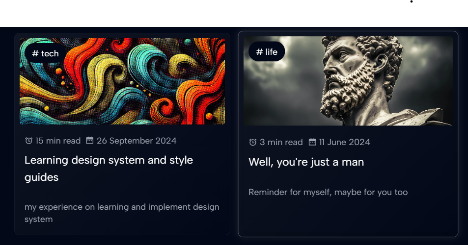
Another example is the card component. I decided to create separate components for different types of cards since they serve different purposes. However, they all follow the same design principles we agreed upon. Below is my blog card, which emphasizes the importance of visual hierarchy.
---
import type { BlogEntry } from "utils/content";
import { formatDate } from "utils/time";
import { getBlogPathName } from "utils/url";
import { Icon } from "astro-icon/components"
import { Image } from "astro:assets";
export type Props = BlogEntry;

const props = Astro.props;
---
<li class:list={[
  'p-2 w-full rounded-lg border border-gray-900',
  'bg-gradient-to-br from-[var(--card)]',
  'scale-500 hover:scale-[1.02] active:scale-[0.97] motion-safe:transform-gpu',
  'transition duration-500',
  'motion-reduce:hover:scale-500',
  'animate-shadow',
  'hover:border-[var(--card-hover-border)] hover:shadow-[0_0_12px_var(--card-hover)]',
]}>
 ...
</li>
As you can see, I used our —card value and its hover state, ensuring that each card is displayed consistently.
Here’s how it looks.

Conclusion
That’s it! Now I have a solid foundation for my website. In the future, if we make changes or add new features, we’ll follow these style guides to ensure everything stays consistent with the theme. Thanks for reading! I hope you found this helpful.
References.

